Website - Theme Settings
The theme settings are where you can make some stylistic choices for how your site looks.
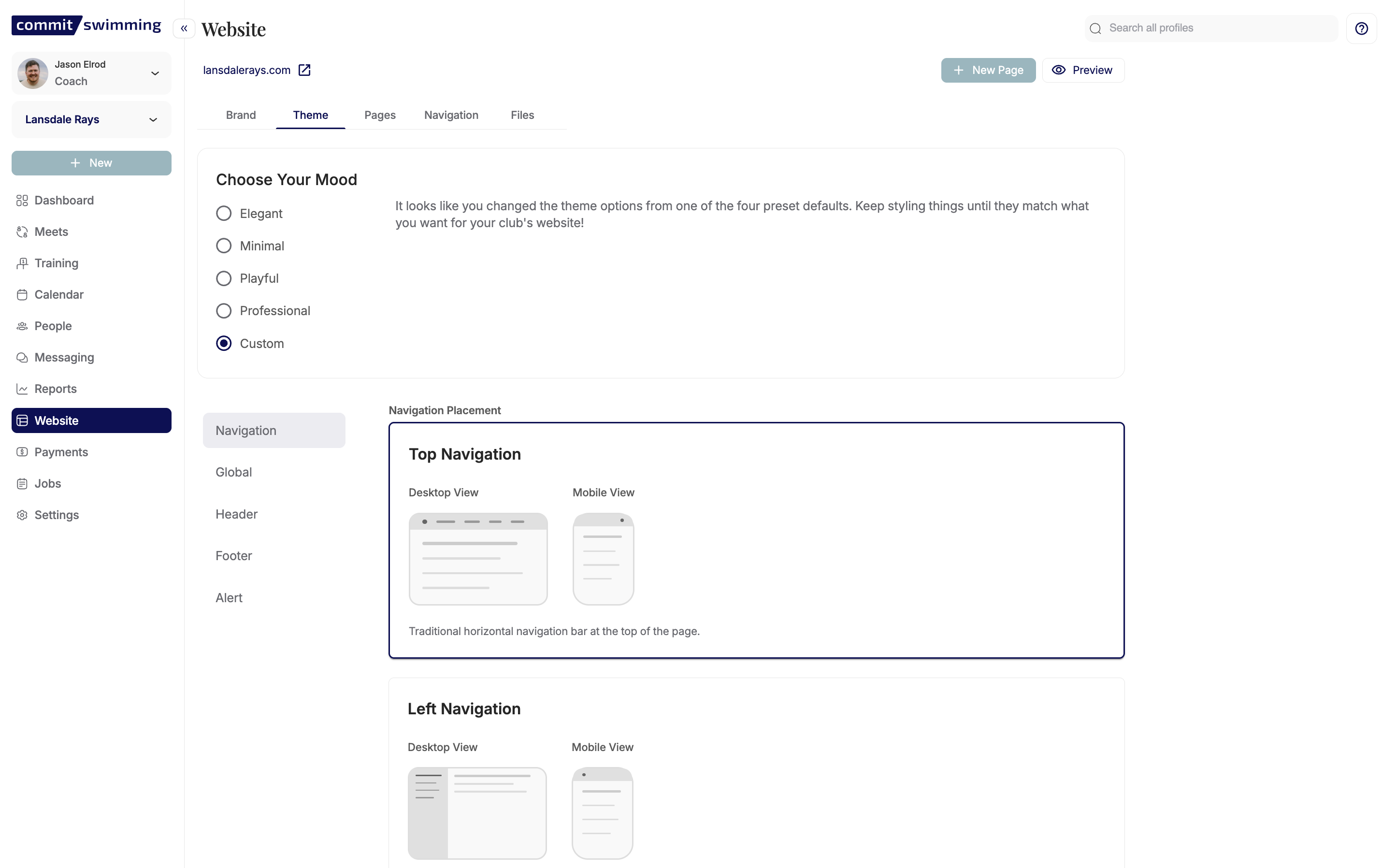
Choose Your Mood
Here you can choose some preset options for your site.
These options allow you to choose a style or mood for how your site will look, or you can use the custom one to make selections of your choosing.
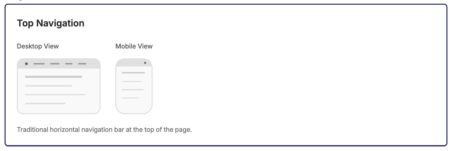
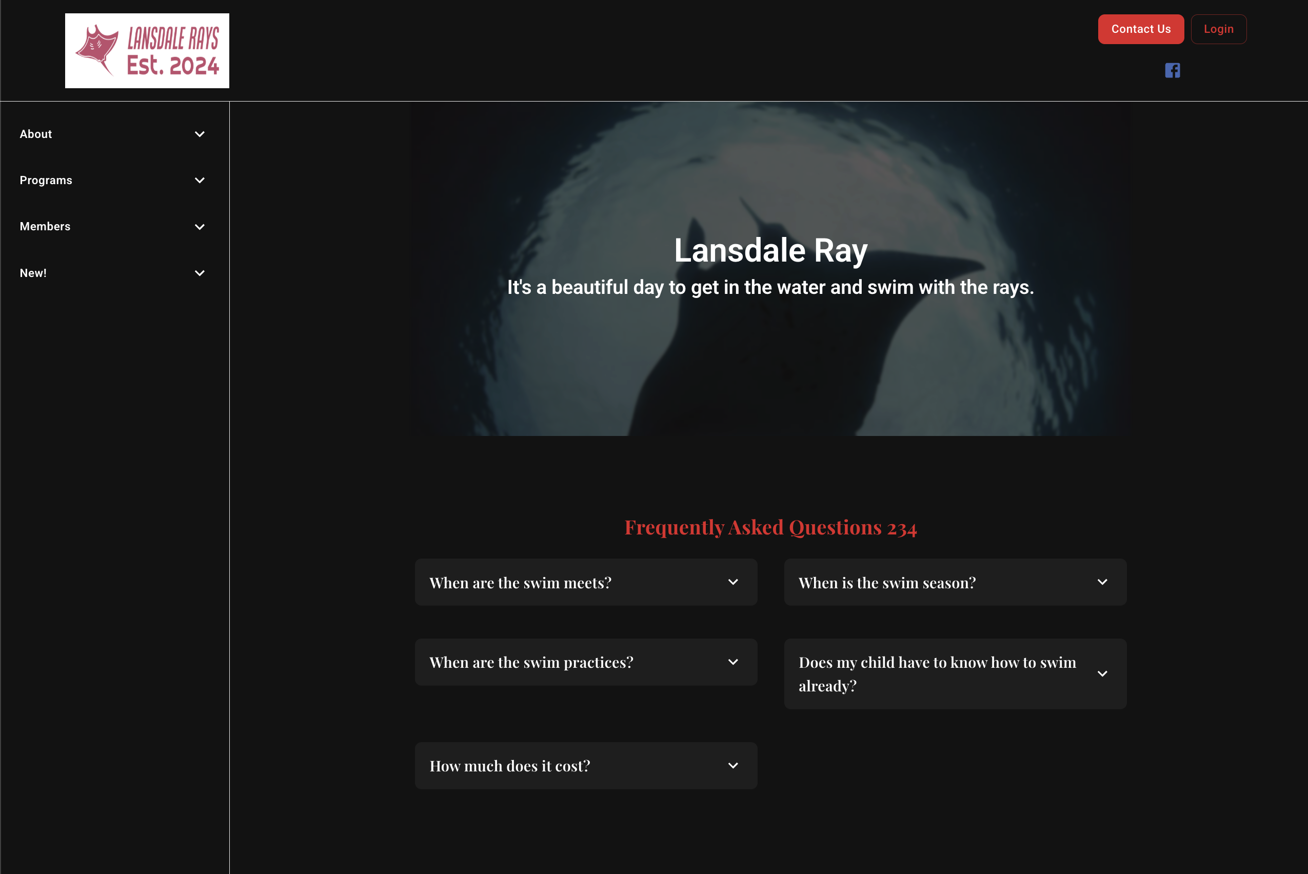
Navigation Settings
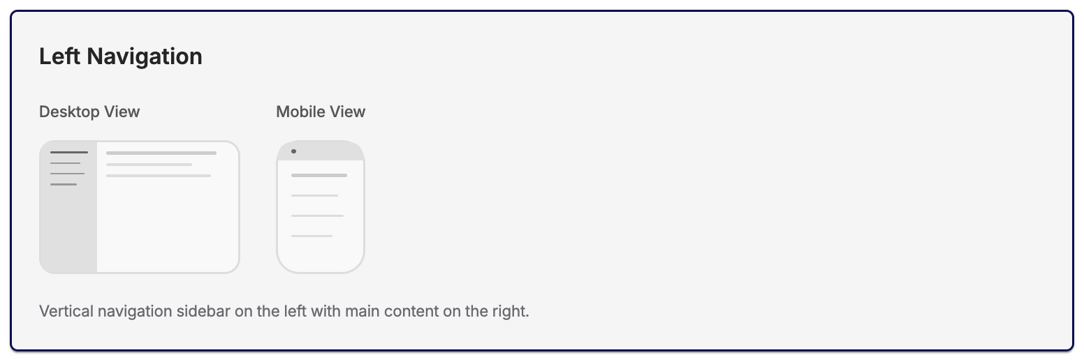
The navigation settings will dictate where and how your navigation bar is placed.
- You can select to bar at the top
- You can choose to place the bar along the left side of the screen.
Global Settings
Options
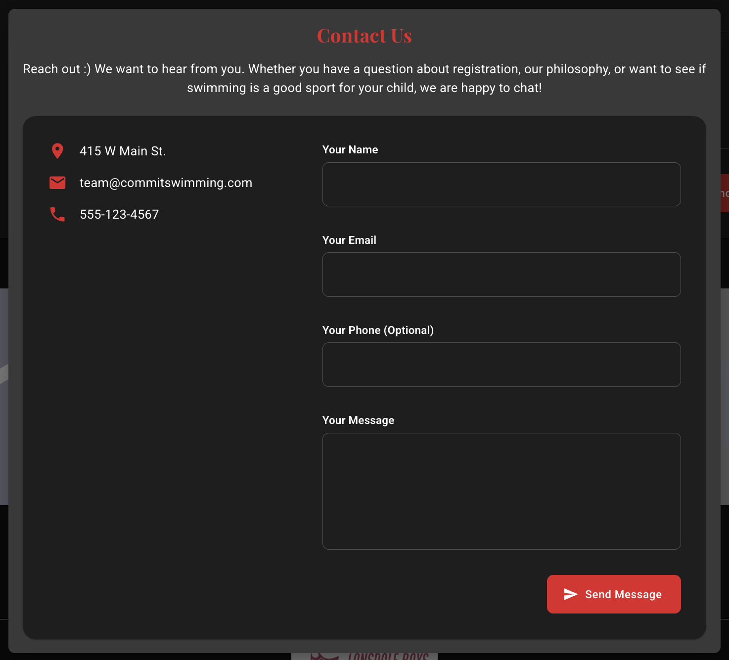
The options menu allows you to edit the information for the universal CONTACT US button (if you choose to include this in the header or footer settings)
Header Contact Us:

Footer Contact Us:
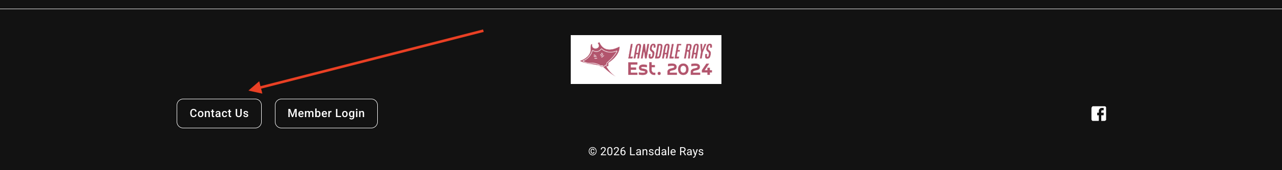
This will be the settings used on the the Contact Us block you can insert into your pages as well.
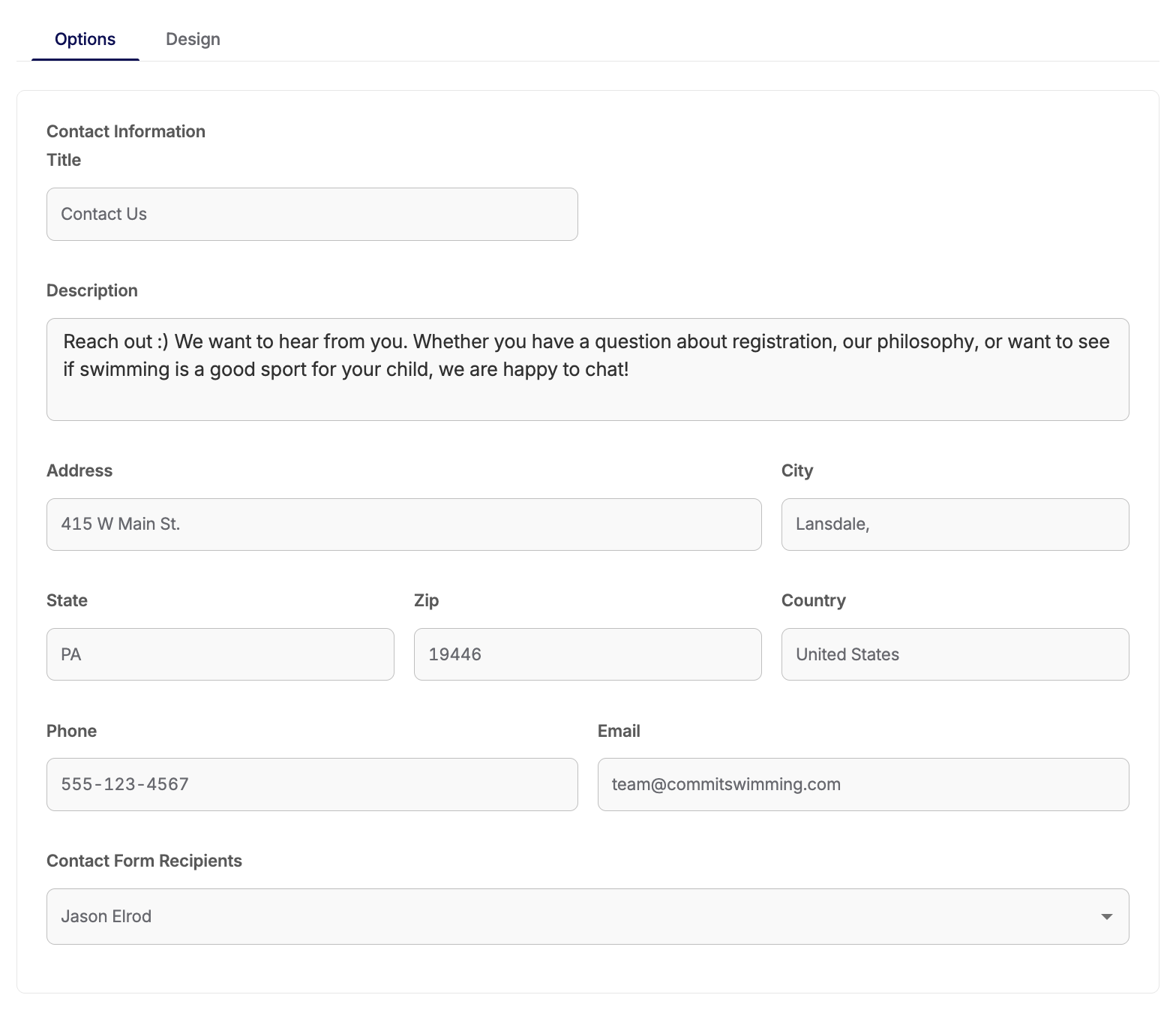
You can customize the name of the button from "Contact Us" to something else, update the description/message that shows when it is clicked and the contact information for your club.
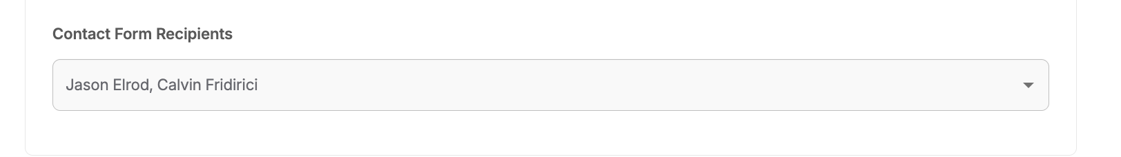
The "Contact From Recipients" allows you to select one, or multiple, staff member(s) to have the message sent to if the Contact Us form is filled our and "Send Message" is selected.
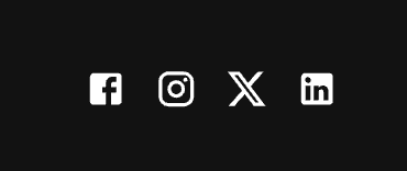
Social Media
You can now include quick links to your social media sites that you can have included in the header or footer of your website.
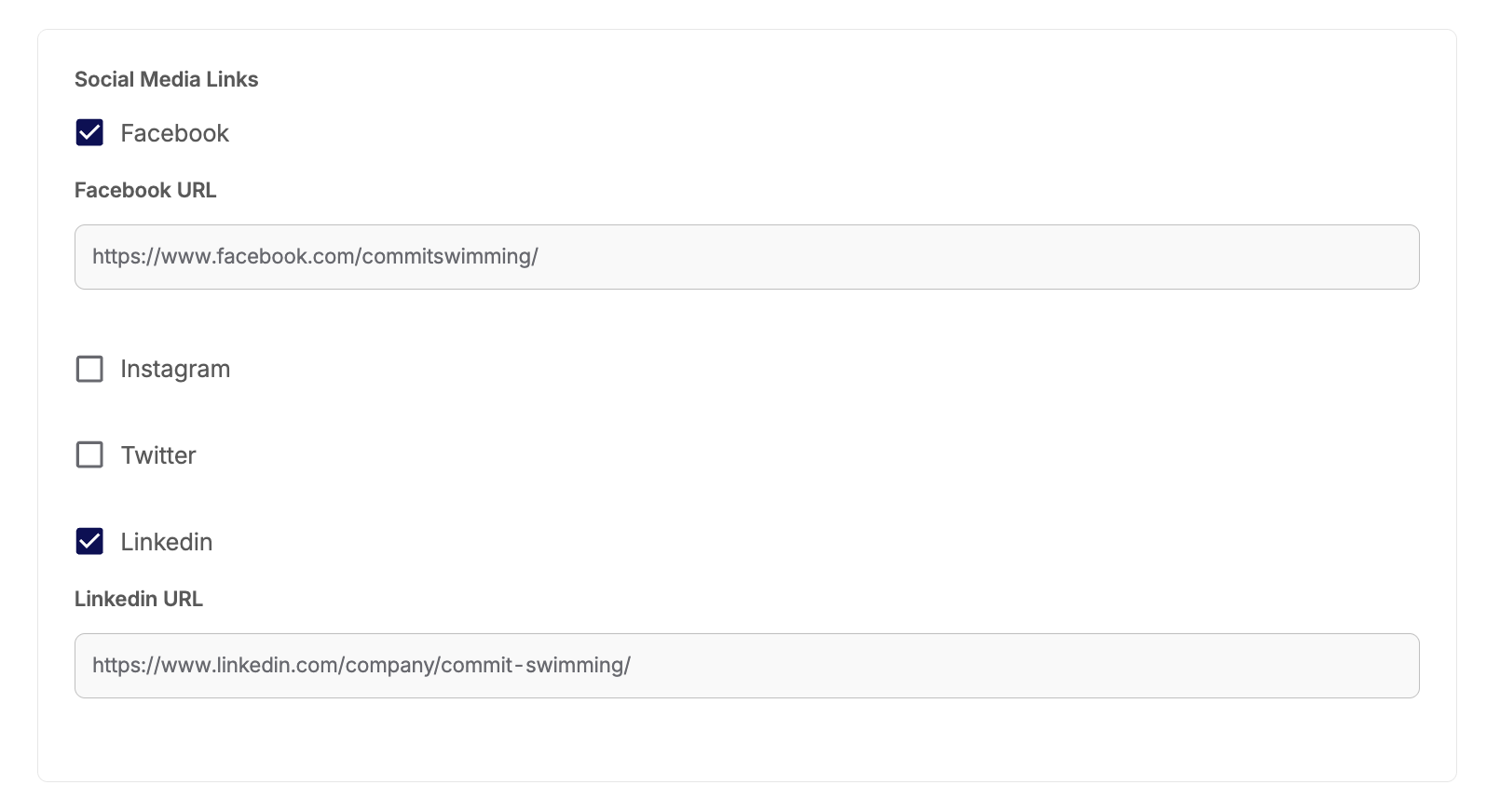
Header:
Footer:
Design
This is where you'll be able to edit and adjust the look and formatting of the text and blocks within your pages. As you make changes, you'll see the preview image update to show you how the changes will be applied.
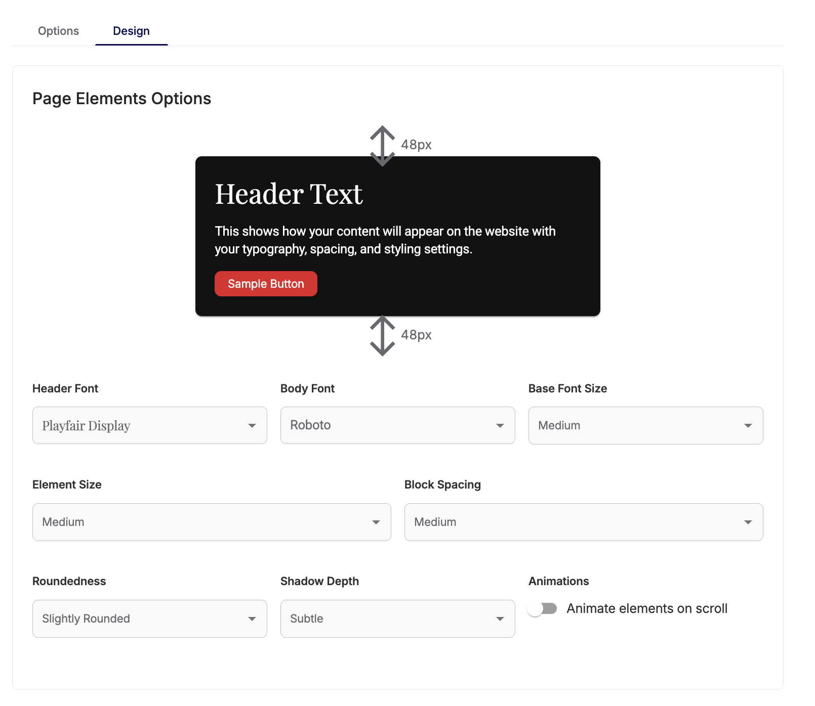
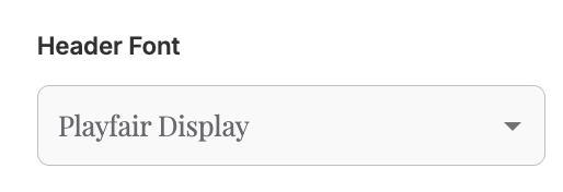
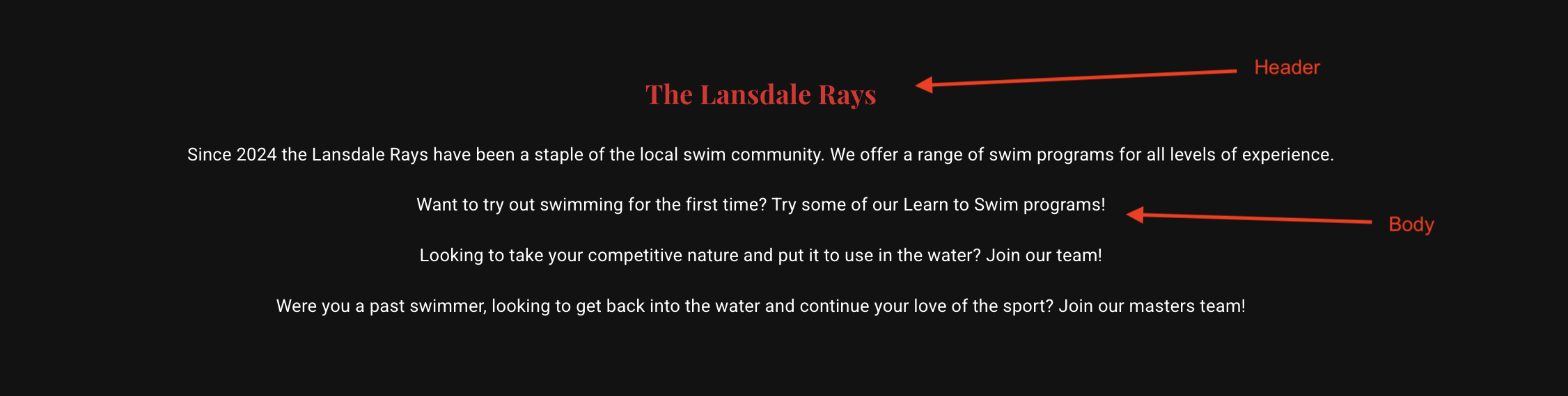
HEADER FONT:
This is where you can choose the font for the header of your blocks if you choose have a header on it.
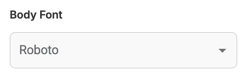
BODY FONT:
This is where you can choose the font for the body of your blocks with text.
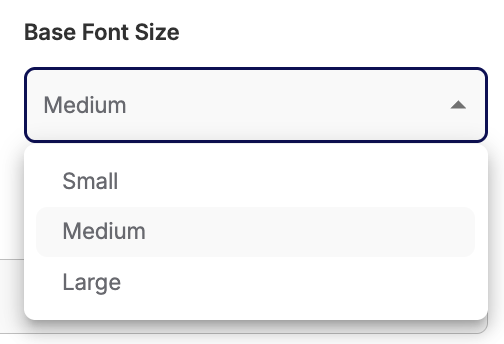
BASE FONT SIZE:
This is where you can make default adjustments to the site sizing of your font - both in the header and the body.
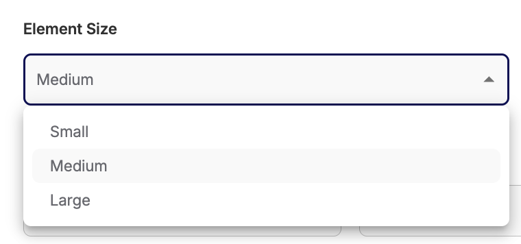
ELEMENT SIZE:
This allows you to adjust the general sizing of your blocks.
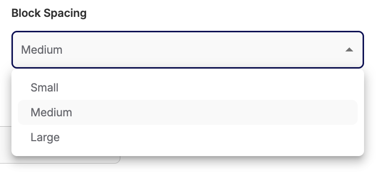
BLOCK SPACING:
This allows you to adjust how much space there is between each block on your page.
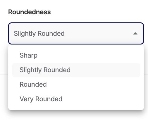
ROUNDEDNESS:
This is where you'll adjust the roundness of your blocks and buttons.
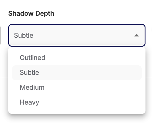
SHADOW DEPTH:
This is where you can add a shadow to your blocks to separate them from the background, if you choose.
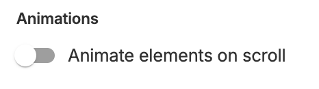
ANIMATIONS:
This option allows you to make some adjustments to how each block loads when you scroll on your page.
If this is off, all the blocks will be loaded right away.
If this is on, the blocks will animate by fading into view as you scroll.
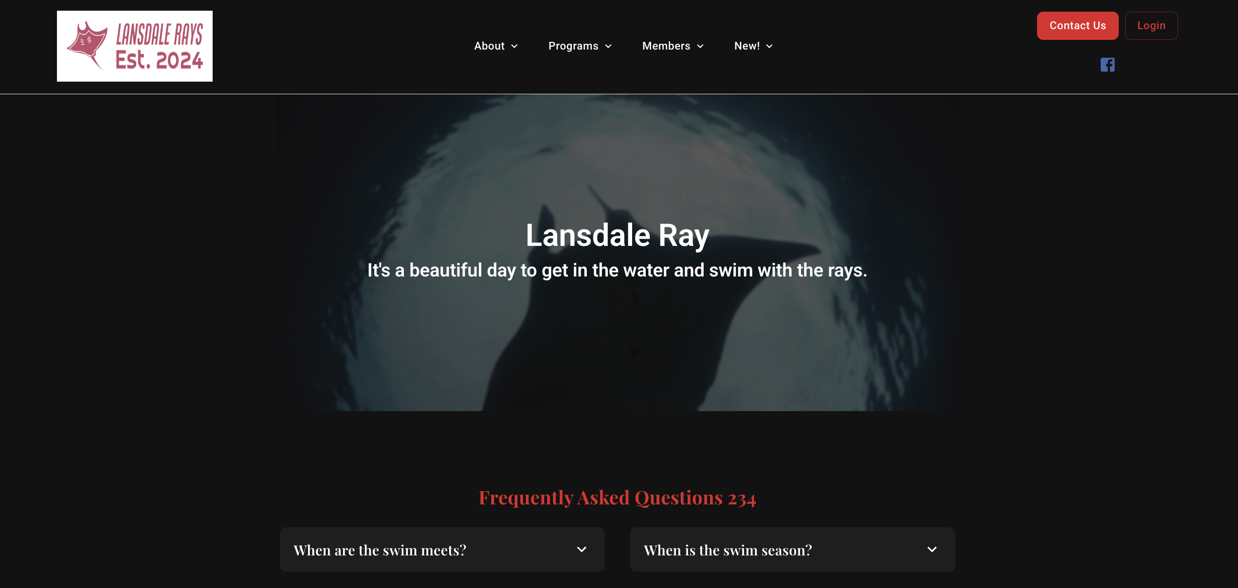
Header Settings
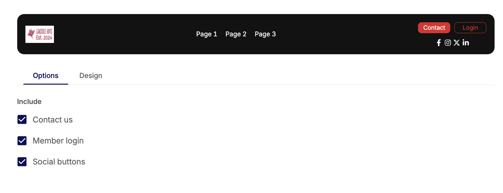
Header Options
The options for the header allow you to choose what you'd like to include or not include for some of your site settings. You will be able to make the same selections, separately, for your footer.
This will update in the preview to show you what you have selected.
You can turn on or off:
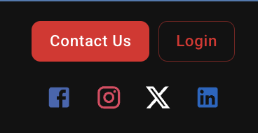
- Contact button: The settings for this are managed under your Global Settings
- Login button: This allows your member to log in to their Commit account and portal
- Social Media links: The URLs for this are set in your Global Settings
Header Design
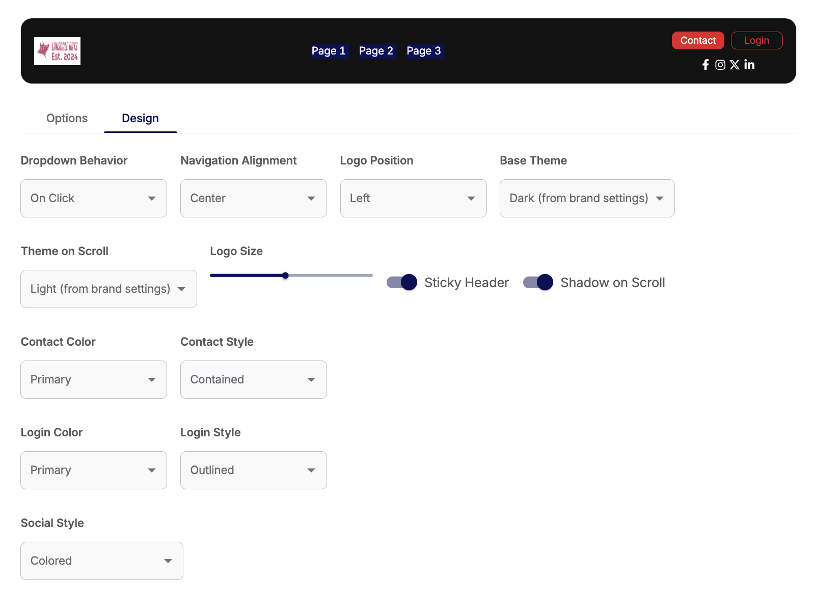
DROPDOWN BEHAVIOR:
This will update how your dropdown menus open. You can hover over it or click it to open the options:
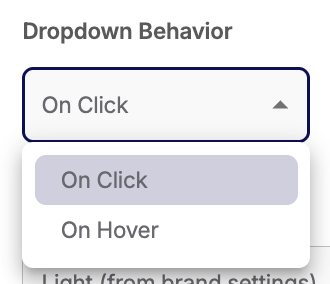
NAVIGATION ALIGNMENT:
You can adjust the navigation menu options to be aligned to the left, the right, or the center?
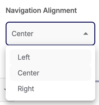
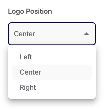
LOGO POSITION:
You can adjust the position of the logo along the navigation bar.
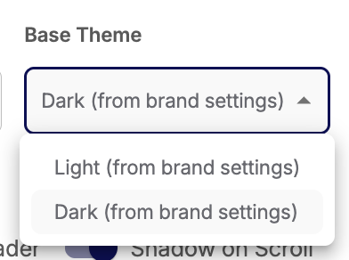
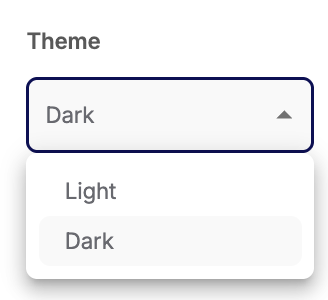
BASE THEME:
You can update the way your navigation bar looks from your Light or Dark themed settings for when you first visit a page.
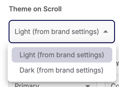
THEME ON SCROLL:
This is different from the Base Theme - this is what your navigation bar will look like when you scroll on a page.
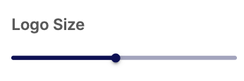
LOGO SIZE:
Adjust the size of your club's logo within the header.
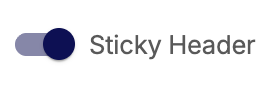
STICKY HEADER:
This allows you to choose if the header scrolls with you, or hides when you scroll. (If this is off, the shadow on scroll is automatically turned off too)
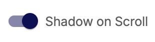
SHADOW ON SCROLL:
This allows you to choose if you have a shadow under the header bar when you scroll or not.
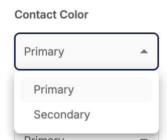
CONTACT COLOR:
You can choose your primary or secondary color for your Contact button.
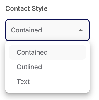
CONTACT STYLE:
This is how you can select how your Contact button looks.
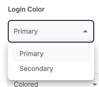
LOGIN COLOR:
You can choose your primary or secondary color for your Login button.
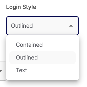
LOGIN STYLE:
This is how you can select how your Login button looks.
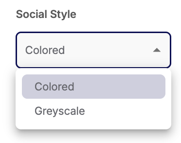
SOCIAL STYLE:
Set if your want your social media icons to be in in color or greyscale
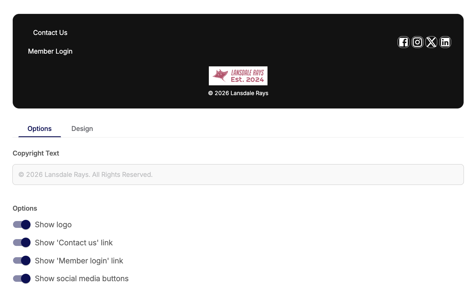
Footer Settings
Footer Options
The options for the header allow you to choose what you'd like to include or not include for some of your site settings. You will be able to make the same selections, separately, for your header.
This will update in the preview to show you what you have selected.
You'll be able to update your Copyright Text.
You can turn on or off:
- Showing your logo
- Contact button: The settings for this are managed under your Global Settings
- Login button: This allows your member to log in to their Commit account and portal
- Social Media links: The URLs for this are set in your Global Settings
Footer Design
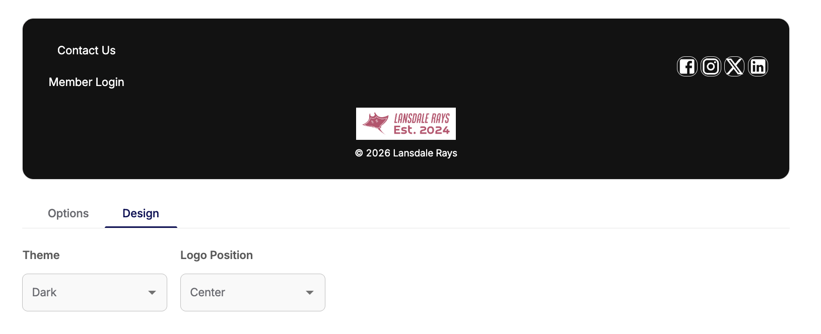
THEME:
You can update the way your footer looks - either Light or Dark themed - for when you first any page.
LOGO POSITION:
You can adjust the position of the logo along the footer.
Alerts
You can set an alert to show up on your website when anyone navigates to it.
The preview will update as your make adjustments.
You can only have one active alert at a time.
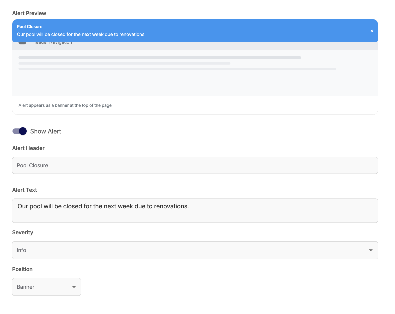
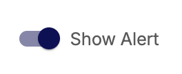
SHOW ALERT:
This turns the alert on or off.
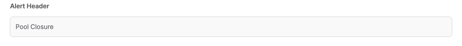
ALERT HEADER:
This is the title of the alert that shows first
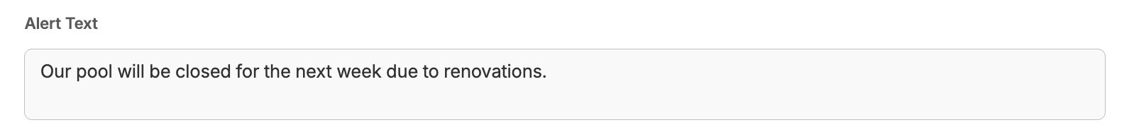
ALERT TEXT:
This is where you can add the actual message of the alert.
SEVERITY:
This lets you set some colors for the alert.
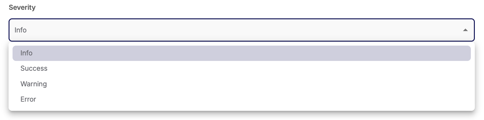
Info = Blue
Success = Green
Warning = Orange
Error = Red
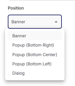
POSITION:
This allow you to change where the alert appears on your site.
Have questions or issues with anything, please contact us at Team@commitswimming.com